
New Image2.5 updates arrive with polished announcements and long feature lists. For everyday creators—freelancers, small-shop owners, designers handling their own visuals—the useful question is narrower: what actually changes in the work I do this week? Which improvements reduce friction, and which ones still require the same human checks as before?
This post looks at the latest Image2.5 update through that practical lens. It is written from the perspective of repeated product, social, packaging, and interior tests rather than from release notes. The goal is to highlight the differences that affect real prompts, real revisions, and real delivery decisions.
What everyday creators should evaluate first
When an update lands I run a short set of controlled checks before changing any client workflow. The checks focus on four areas that matter most in daily work:
Product consistency across multiple scenes
Material honesty (especially matte and dry surfaces)
Short text and label stability
How much revision is still required to reach a usable frame
These four points determine whether the update saves time or simply produces different-looking near-misses. Attractive new stylistic options are secondary until the core reliability questions are answered.
Consistency across scenes
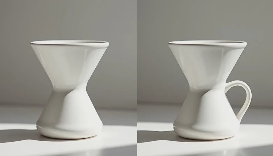
One of the most frequent requests from small brands is a set of images that feel like the same product in different settings. Earlier versions of Image2.5 often drifted in proportions, surface quality, or small structural details when the scene changed.
The latest update shows noticeable improvement in holding overall form when the same product description is reused. Feet, spouts, shoulders, and basic silhouettes stay closer to the baseline across simple environment changes. The improvement is not perfect—small features can still soften—but the number of usable multi-scene sets has increased. For campaign work this reduces the need for heavy reinforcement language in every prompt.
Material response, especially matte and dry finishes
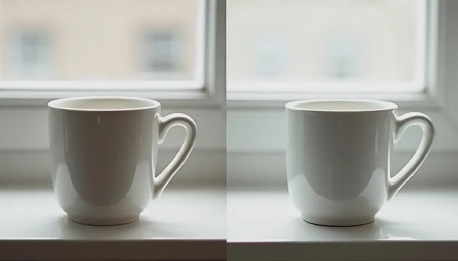
Plastic-looking surfaces have been a persistent issue with ceramic, kraft paper, uncoated stock, and soft-touch coatings. The latest update responds more reliably to explicit dry-material language and clear negatives about gloss or plastic shine.
In side-by-side tests, matte ceramic and dry kraft now retain more of the intended surface quality on the first or second generation. The model still benefits from strong physical descriptions (“dry matte,” “uncoated fiber texture,” “no specular highlights”), but the baseline behavior has moved closer to honest material rendering. This helps product and packaging concept work where surface character is part of the decision.
Short text and simple labels
Text remains one of the harder problems. The latest update shows modest gains with very short labels—one to three words in clean, high-contrast settings. Longer lines, fine print, and anything placed on curved or angled surfaces still distort or drop characters frequently.
For everyday use this means short product names and simple descriptors are more often usable at thumbnail and social sizes. Anything that must be fully legible on a product page or in a detailed packaging mockup still needs careful checking and, in many cases, external text handling. The update narrows the gap for light social use; it does not remove the need for human review on critical text.
Revision volume and first-usable rate
A practical measure of any update is how many generations are required to reach a frame that meets a clear brief. In recent product and social tests the first-usable rate has improved for straightforward briefs that lock proportions, material, and light direction early.
Complex interior scenes and multi-object packaging still often need two or three targeted revisions. The difference is that the revisions more frequently fix the intended problem instead of introducing new ones. That change compounds across a full campaign or concept set and reduces total time spent.
What has not changed enough to alter core habits
Several working practices remain necessary:
A clear brief before any prompt still prevents the majority of wasted generations.
Locked product language across a set is still the most reliable way to protect consistency.
Explicit material and light direction language still outperforms vague aesthetic requests.
Final channel checks (real text overlays, actual crops, side-by-side comparison with existing brand images) are still required before delivery.
The update improves the model’s response to good direction. It does not remove the need for that direction.
How to test an update for your own work
A short personal test sequence helps separate real improvement from announcement language:
Re-run two or three of your most common briefs with the same prompts used before the update.
Compare consistency, material response, and revision count side by side.
Note only the differences that would change a delivery decision or reduce time.
Update your personal prompt library only where the new behavior is clearly better.
This keeps the evaluation tied to the images you actually need to produce.
Practical takeaway for everyday creators
The latest Image2.5 update delivers measurable but incremental gains in the areas that matter for daily work: better consistency across simple scene changes, more reliable response to dry-material language, slightly stronger short-text performance, and a higher rate of first- or second-generation usable frames on clear briefs.
It does not eliminate the need for structured briefs, locked product descriptions, or final human judgment. The creators who benefit most are those who already work with clear constraints and now receive a more cooperative response from the model.
Treat the update as an improvement in reliability rather than a transformation of the workflow. Keep the habits that already produce usable results, and adjust only where the new behavior is demonstrably stronger. That approach turns release notes into practical advantage without disrupting the process that already works.