
When I first started testing Image2.5 for product work, I expected the biggest challenge to be finding the “right” prompt. That turned out to be only half the story. The real work sits in the brief itself—knowing what the image needs to communicate before any generation begins. Image2.5 can produce clean, well-lit product shots quickly, yet the results often miss the details that make a photo useful for a small online shop or a freelance designer: accurate proportions, believable materials, readable labels, and a sense of scale that matches the real object.
This post walks through one complete assignment I handled for a small Portland-based home-goods brand. The goal was a simple lifestyle product image of a ceramic pour-over coffee dripper. The client needed something that looked premium enough for Instagram but still honest enough for their product page. No heavy styling, no fake marble surfaces, just a clear, believable shot that showed the dripper’s shape, matte glaze, and how it sits on a counter.
I will show the original brief, the first prompt, the first result, what failed, the revised prompt, and the final image. Along the way I will point out the decisions that actually moved the result forward and the common traps that still catch me even after months of testing Image2.5.
Start with the brief, not the prompt
Before opening Image2.5 I write a short creative brief on paper. It takes five minutes and prevents most of the wasted generations later. For this project the brief looked like this:
Product: matte white ceramic pour-over dripper, conical shape, three small feet, visible pour spout
Setting: light wood counter, soft morning window light, no props except a simple linen napkin
Mood: calm, functional, slightly premium
Must show: accurate proportions, realistic glaze texture, readable silhouette
Avoid: glossy plastic look, floating objects, over-styled backgrounds
This brief became the measuring stick for every generation. If an image looked beautiful but failed any of the “must show” points, it was not usable.
Many people skip this step and jump straight into prompt writing. The result is usually a string of pretty but unusable images. Image2.5 responds well to clear visual direction; it struggles when the direction itself is vague.
The first prompt and the first result
I began with a straightforward prompt that followed the brief closely:
“A matte white ceramic pour-over coffee dripper on a light wood kitchen counter, soft morning window light from the left, clean composition, product photography style, realistic glaze texture, accurate proportions”
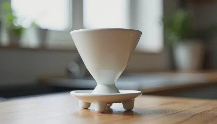
The first generation looked polished. Soft light, clean background, nice depth of field. At a quick glance it could pass for a real product photo. Closer inspection revealed three problems that made it unusable for the client:
The conical body was slightly too wide at the base, changing the real silhouette.
The glaze had a subtle plastic sheen instead of the dry matte finish of the actual ceramic.
The three small feet were barely visible, so the dripper appeared to float.
These issues are common with Image2.5 product work. The model tends to smooth surfaces and average out proportions unless you specifically protect the details that matter.
What the first result taught me
I keep a simple failure log for every Image2.5 test. For this generation the notes were short:
Proportions drifted because the prompt only said “conical.”
Material description needed stronger language about surface quality.
Supporting elements (the feet) disappeared because they were small and not emphasized.
None of these problems required a completely new approach. They only needed tighter language and a clearer hierarchy of what the image must protect.
The revised prompt
I rewrote the prompt with three specific changes:
“Matte white ceramic pour-over coffee dripper with clear conical body, three small visible feet, and short pour spout, resting on a light oak wood counter, soft natural window light from the left creating gentle shadows, realistic dry matte glaze texture with subtle surface variation, accurate real-world proportions, clean product photography composition, no plastic shine”
The key adjustments were:
Named the exact visual features that had to stay accurate (conical body, three small feet, short pour spout).
Replaced “realistic glaze texture” with “dry matte glaze texture with subtle surface variation.”
Added “no plastic shine” as a direct negative instruction inside the prompt.
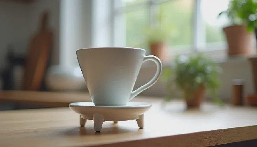
The second generation fixed the proportions and the feet. The glaze still looked slightly smoother than the real object, but it no longer read as plastic. That was close enough for the client’s Instagram and product-page needs.
When to stop revising and when to start over
After two generations I had a usable image. I could have continued refining the surface texture, but the client’s deadline and budget did not require a perfect match to the physical dripper. Knowing when to stop is part of working efficiently with Image2.5.
I use a simple rule: if the image communicates the product’s shape, material character, and intended mood, and if the remaining differences would not confuse a customer, the image is done. Further generations often introduce new problems while fixing small ones.
There are times when starting over is faster. If the composition itself is wrong—wrong camera height, wrong crop, wrong lighting direction—I discard the prompt and write a new one rather than trying to repair it. Image2.5 responds better to a clean direction than to a long list of corrective instructions.
Practical tips that keep showing up in my tests
After many product assignments with Image2.5, a few patterns keep repeating:
Name the exact features that must stay accurate. “Ceramic mug” is weaker than “cylindrical ceramic mug with slightly flared rim and visible handle attachment.”
Describe surface quality in physical terms. “Matte,” “dry,” “slightly textured,” and “no gloss” work better than “realistic material.”
Keep the background simple when the product itself is the focus. Complex environments compete for attention and often distort scale.
Protect small structural details by listing them early in the prompt. Feet, seams, handles, and logos are the first elements Image2.5 tends to soften or remove.
Compare the generated image to a real photo of the product side by side. The differences that matter become obvious within seconds.
I also keep a short “Maybe Later” folder of near-miss generations. Some of them become useful reference when a similar product appears months later.
What Image2.5 handled well and what still needed human judgment
In this case Image2.5 handled lighting, overall composition, and basic material suggestion with very little effort. The soft window light and clean counter felt natural on the first try. What still required human judgment were the proportions, the exact surface quality, and the decision about whether the image was good enough for the intended use.
That division of labor is typical. Image2.5 is strong at producing a believable first draft. The designer’s job is to protect the details that matter for the real product and the real audience.
A simple workflow you can reuse
Here is the process I now follow for most product image work with Image2.5:
Write a short brief that lists must-show features and must-avoid problems.
Create a first prompt that follows the brief closely.
Generate and evaluate against the brief, not against general “beauty.”
Revise only the parts that failed. Keep the rest of the prompt stable.
Stop when the image is usable for the actual channel (product page, social, ad).
Archive both the successful and the near-miss results for later reference.
This workflow does not guarantee a perfect image on the first try. It does keep the process short and focused on what the client or the brand actually needs.
Image2.5 continues to improve, yet the core habit remains the same: start with a clear sketch of what the image must communicate. The prompt comes second. The generation comes third. The judgment about whether the result is useful stays with the human who understands the product and the audience.
That is still the most reliable way I have found to create better product images with Image2.5.