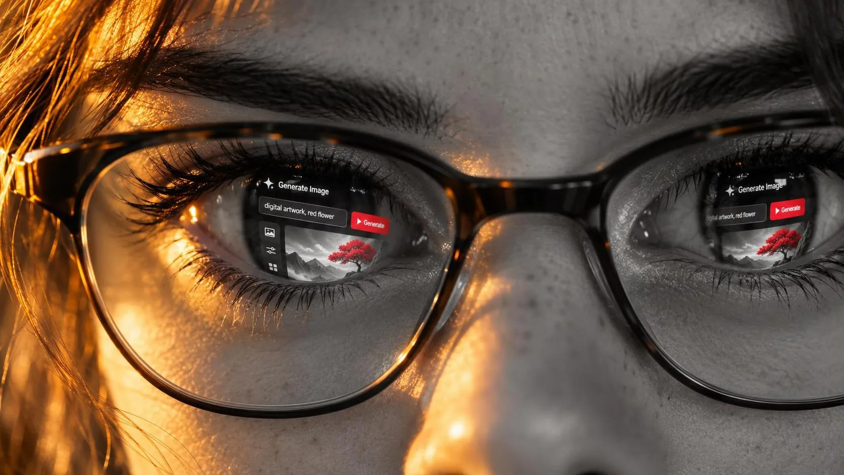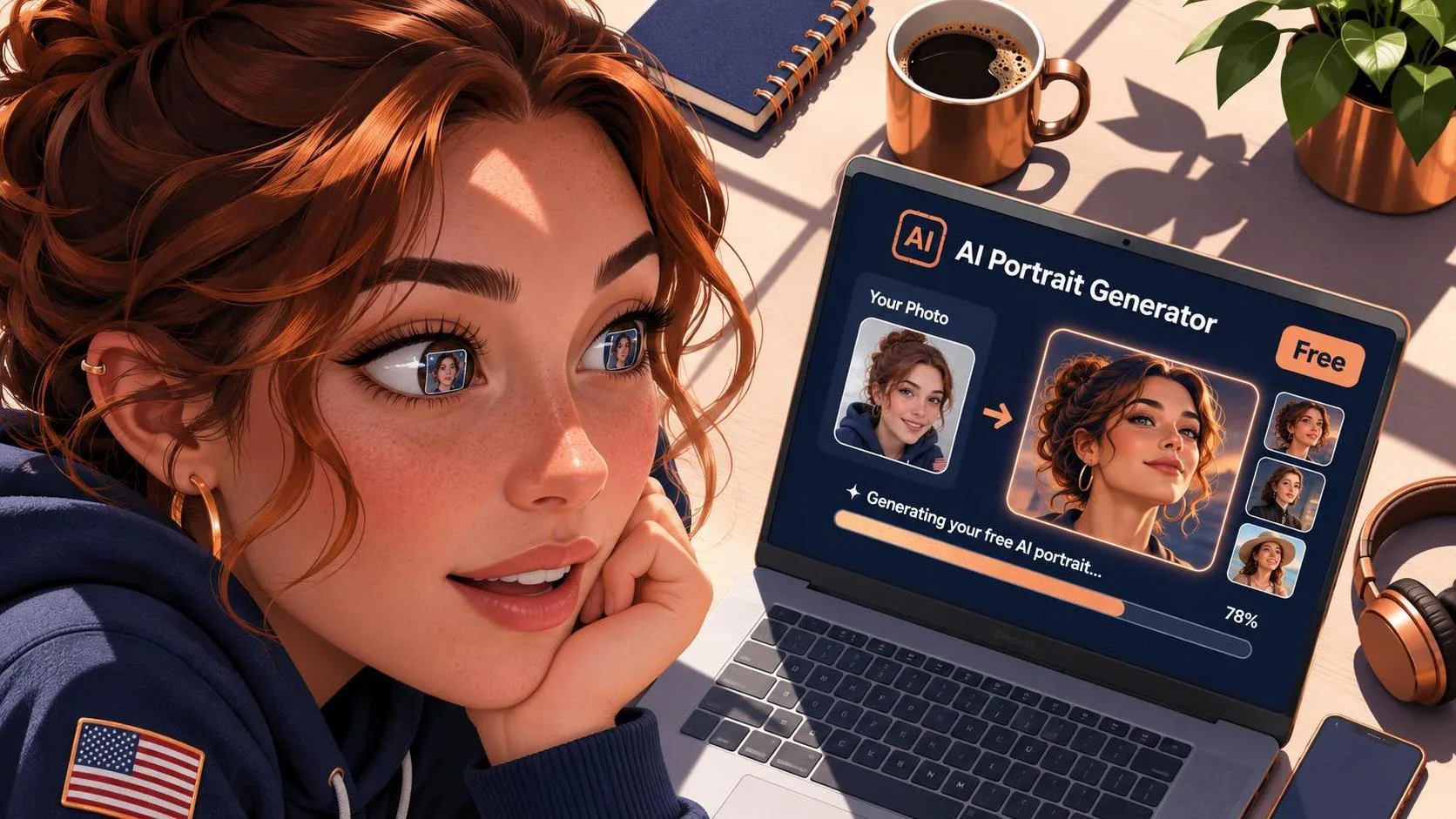
When people search for ai create, they are often looking for a quick path from a half-formed idea to a finished image. The tempting version of that process is simple: type a few words, press a button, and wait for something beautiful. In practice, the useful work starts before the prompt. You need a visual goal, a clear subject, and an honest way to judge the result.
I use Image2.5 experiments for product concepts, social graphics, packaging studies, and personal projects. This site is an independent resource, not an official OpenAI or ChatGPT publication. My approach is straightforward: start with a sketch, even if that sketch is only three sentences in a notebook.
What ai create is good at
The strongest use of ai create is not replacing a complete creative brief. It is helping you explore possibilities quickly. A small coffee company might need a warm image of a ceramic mug beside a pastry, with room for a headline on the left. A designer may want six directions for a poster before choosing one to refine. A freelancer could test whether a client’s concept feels playful, premium, handmade, or technical.
Those are useful starting points because the visual problem is specific. “Make a cool picture” gives the system almost nothing to solve. “Create a quiet morning product scene with a matte green mug, folded linen, soft window light, and clear empty space in the upper left for copy” gives it relationships, materials, lighting, and layout.
The result still needs judgment. Generated images can have convincing atmosphere but awkward handles, inconsistent labels, strange shadows, or typography that looks almost readable. Almost is not good enough for packaging or an advertisement. Treat the first image as a visual conversation, not a final delivery.
Write the brief before the prompt
Before using ai create, write a compact brief with five parts: subject, purpose, composition, mood, and restrictions. The subject answers what must appear. Purpose explains where the image will be used. Composition describes placement and camera viewpoint. Mood gives the emotional direction. Restrictions prevent common mistakes.
For example, a brief might say: “Create a square social image for a small bakery. Show one blueberry tart on a pale stone counter, photographed from a slightly raised angle. Use morning light and a calm, handmade mood. Keep the background simple, avoid extra pastries, and leave the upper right area open for text.”
That brief is more useful than a pile of decorative adjectives. It tells the model what matters and gives you a way to inspect the result. Did it make one tart or three? Is the open area still available? Does the lighting support the bakery’s personality? A prompt should help answer those questions.
I also separate must-haves from nice-to-haves. If the tart, square crop, and empty text area are essential, they belong near the beginning. “A subtle vintage feeling” can come later. This hierarchy makes revisions easier because you know what to protect when the image changes.
A practical prompt structure
A reliable ai create prompt usually moves from the most important information to the supporting details. Start with the image type and main subject. Add the action or arrangement, then describe the environment, lighting, camera angle, color direction, and exclusions. Finish with the intended use if it affects framing.
Here is a useful example: “Commercial product photograph of a cobalt blue reusable water bottle standing on a warm beige pedestal, soft side light, subtle shadow, clean studio background, front three-quarter view, realistic brushed metal cap, vertical composition with negative space above for a headline, no hands, no extra bottles, no readable brand logo.”
The prompt does not guarantee perfection. It gives the image a job. If the first attempt makes the bottle too small, revise the composition instead of adding random adjectives. Try “the bottle fills most of the frame” or “camera positioned close to the product.” If the cap looks melted, describe its shape and material more directly.
Avoid stacking contradictions. “Minimal but busy, soft but dramatic, flat but dimensional” creates competing instructions. Choose the dominant direction and let smaller details support it. Clear prompts are not necessarily short prompts; they are organized prompts.
Revise one problem at a time
The best results I have seen from ai create usually come from a calm revision loop. First, identify the biggest problem. Second, describe the change in plain language. Third, preserve everything that already works. Fourth, compare the new result with the brief.
Imagine a first generation of a skincare bottle scene. The colors are right, the reflections look believable, and the bottle is centered. However, the label is too small and the flowers overpower the product. A focused revision could say: “Keep the same lighting, bottle color, camera angle, and background. Make the bottle label larger and easier to see. Reduce the flowers to two small stems placed behind the bottle.” That is more useful than starting over with a completely different mood.
Make a small archive of failed attempts. I keep promising images in a folder called “Maybe Later,” along with notes about what failed. One image may have excellent light but a poor crop. Another may have the right composition but unusable lettering. Saving them prevents repeated experiments and sometimes reveals a solution for a later project.
For text-heavy work, I usually create the visual without relying on generated words, then add final typography in Figma, Photoshop, Canva, or another design tool. Image models can suggest a label or poster treatment, but production text needs exact spelling, spacing, and hierarchy.
Where the workflow needs human judgment
Using ai create responsibly means reviewing more than whether an image looks attractive. Ask whether the product has the correct proportions, whether the materials make physical sense, and whether the image supports its intended message. A beautiful scene that hides the product is not a successful product image.
Brand consistency matters too. If a company uses restrained colors and generous space, a glossy, crowded generation may be visually impressive but commercially wrong. Create a small reference sheet with approved colors, sample layouts, product angles, and words that describe the brand. Use it to evaluate each result.
Rights and permissions also deserve attention. Do not upload confidential client materials, unreleased packaging, or personal images unless you have permission and understand the tool’s handling options. Avoid asking for an exact living artist imitation. Describe visual qualities such as limited colors, rough ink texture, geometric forms, or editorial lighting instead.
The Image Guide tests workflows through outcomes rather than collecting magic formulas. A prompt that works for a ceramic mug may fail for a reflective watch. The subject, material, audience, and layout all change the problem.
Three useful starting projects
If you are new to ai create, begin with a project that has a clear finish line. Create three social images for one imaginary coffee product, keeping the color palette consistent. Next, make a simple product hero image with empty space for a headline. Finally, take one successful image and produce three controlled variations: change the lighting, then the camera angle, then the setting.
These exercises teach more than a giant prompt list. You will notice which details remain stable, which ones drift, and how much a single composition phrase can change the result. Record the prompt, the first problem, the revision, and the final choice. That record becomes a repeatable process instead of a lucky accident.
For a client project, show the reasoning rather than only the polished frame. A small presentation with the brief, first direction, revision notes, and final image helps people understand what was tested. It also makes approval conversations more concrete.
A grounded way to begin
ai create is most useful when it supports a designer’s eye instead of pretending to replace one. Start with a sketch, define the visual job, and make the first prompt specific enough to evaluate. Then revise the largest problem while protecting the elements that already work.
Expect occasional odd hands, wandering labels, impossible reflections, and compositions that ignore your carefully requested empty space. That is part of the process. The goal is not to produce a perfect image from one sentence. The goal is to build a workflow that helps you discover, compare, correct, and finish useful visuals.
When you are ready, choose one small assignment and test it from brief to final result. The lesson will come from the comparison between those stages, not from the prompt alone.