You need a clean product image for a social post, not a jar with a beautiful label that turns into alphabet soup when you zoom in. If you’re searching for gpt image 2.5, start by checking OpenAI’s own product pages and the model or tool names shown in your account: I can’t confirm that this exact name identifies an officially released OpenAI image model. You can still use the workflow below with an image-generation tool available to you.
The Image Guide is an independent publication and is not affiliated with OpenAI or ChatGPT. The examples here are illustrative creative briefs, not claims about a particular model’s performance.
First, check what you can actually use
Names matter because a blog post, a third-party app, and an official model selector may describe different things. Before building a workflow around gpt image 2.5, look for the exact name in OpenAI’s official documentation or in the interface you intend to use. Check whether image creation is included with your account, whether there are usage limits, and whether the feature accepts an uploaded reference image.
If a third-party service uses the name, check which provider and model it says it connects to. A familiar-looking label alone doesn’t establish that the service is operated by OpenAI. Review its pricing and privacy terms before uploading product photos, customer information, or unfinished campaign assets.
For a first project, choose something forgiving: a mood image, an illustrated background, or a concept for a social post. A precise package mockup with legal copy is a harder starting point because small errors can make the asset unusable.
Start with a sketch and a specific brief
A useful image starts with a decision about its job. Imagine a small coffee business needs a square social graphic announcing a seasonal blend. The visual should leave room for a headline, feel warm rather than rustic, and avoid showing a fictional product package as if it were real.
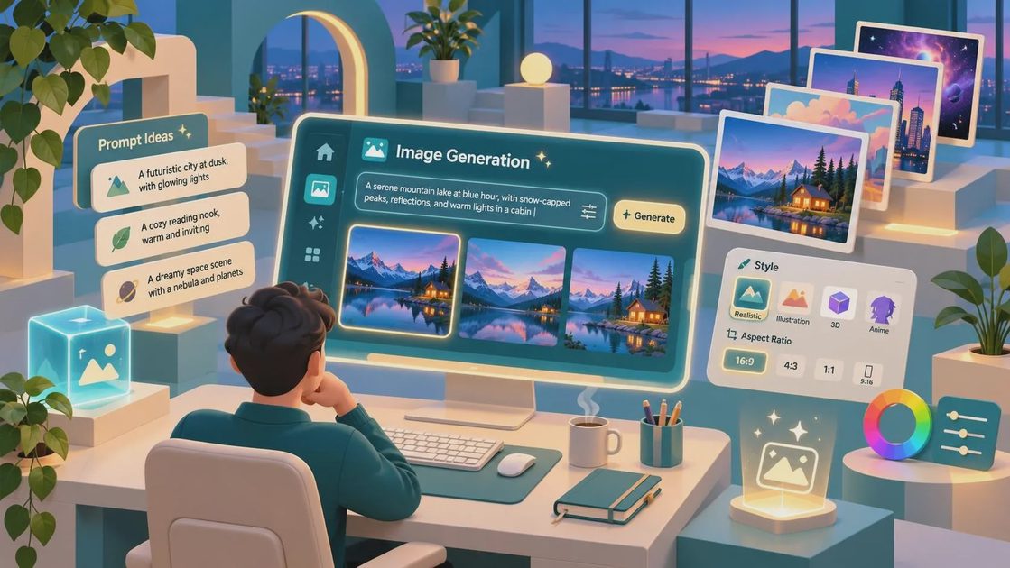
Before opening gpt image 2.5 or another image tool, sketch the layout on paper: cup on the right, open space on the left, soft background behind both. Your sketch doesn’t need to be good. Mine would be a rectangle, a circle, and a suspiciously wobbly cup handle.
Then describe the arrangement in plain language. For example:
“Create a square editorial-style photograph for a coffee shop’s seasonal announcement. Place a ceramic coffee cup on the right side of a light oak table, with soft morning window light coming from the left. Use a warm cream and muted brown palette. Leave the left third visually quiet for a headline that will be added later. No text, logos, or packaging.”
Each instruction has a purpose. The square format suits the intended placement; the empty area gives the headline somewhere to live; and excluding packaging avoids inventing a product label. The prompt describes the visual direction without pretending that more adjectives automatically produce a better image.
Evaluate the draft before revising
When a first image comes back, look at it at the size people will actually see it. Is the cup recognizable on a phone screen? Is the reserved space truly uncluttered? Does the light make sense across the cup, table, and background? A lovely full-screen image can still fail as a small social graphic.
With gpt image 2.5 or any comparable generator, treat the first result as a draft rather than a promise. If the cup is centered and the left side is crowded, revise the composition instead of adding a long list of style words:
“Keep the warm window light and cream palette. Move the cup farther to the right, show only one cup, and make the left third an uninterrupted pale wall and tabletop. Preserve enough contrast for a dark headline.”
If the tool supports editing an existing image, use that option to request the change. If it generates a fresh image instead, include the details you want to retain in the revised prompt. Either way, the outcome may change beyond the requested area, so compare the whole image again. This is a revision strategy, not a report of a completed test.

Save the promising draft and note what needs to change before generating again. Otherwise, it’s easy to replace a useful composition with a prettier image that no longer has room for the message. I like judging drafts by the brief first and the visual charm second; the charming cup can wait its turn.
Handle text, products, and references carefully
For business work, I’d usually add important text in a design editor after generation. A model may produce convincing lettering, but you still need to check every character, line break, price, and date. Adding the headline separately also makes future edits much less painful.
Product accuracy deserves the same care. If you have permission to use a real product photo and your chosen tool accepts uploads, describe which details should remain unchanged: the container shape, label placement, cap color, and proportions. Then compare the result with the source at full size. An attractive approximation is not a reliable depiction of an item customers will receive.
Don’t upload confidential assets or anyone else’s photographs without the necessary permission. For paid campaigns, review the tool’s terms and the applicable rights and permissions for your intended use. A generated image is not a substitute for checking whether a visible logo, recognizable person, or reference image can be used in your particular context.
Prepare the image for its destination
Before exporting a project made with gpt image 2.5, confirm the dimensions and crop required by the platform or client. Keep important objects away from the edges, especially if the same image will be adapted from a square post to a vertical story. Generate or design a separate composition when a simple crop cuts off the subject or the headline space.
Finally, inspect the downloaded file for awkward edges, strange reflections, accidental marks, and distracting background details. Add the final copy, check contrast, and review it on both a large screen and a phone. If the brief calls for an accurate product image and the details still drift, use a real photograph or a conventional mockup instead. The right image is the one that does the job, not the one that took the most prompts.