A blank canvas can feel strangely loud. You know the image should be calm, useful, and a little memorable, but the first sentence of the brief refuses to arrive. Text to image ai helps turn that foggy starting point into a visual draft, but the strongest results rarely come from tossing in a handful of adjectives and hoping for magic. They come from a clear goal, useful references, and a willingness to revise.
I use Image2.5 for experiments involving product scenes, social graphics, packaging concepts, and the occasional orange cat pottery idea. This independent publication is not affiliated with OpenAI or ChatGPT. The goal here is simple: study what works, understand what fails, and make the process easier to repeat.
Begin with the visual problem
Before writing a prompt, describe the job the image needs to do. A coffee shop may need a warm Instagram image for a seasonal drink. A small online store may need a clean hero image showing a ceramic mug at a believable scale. A designer may need three poster directions, not one supposedly perfect final.
That distinction matters because a pretty image can still be unusable. The mug might have an awkward handle, the label may contain nonsense lettering, or the composition may leave no room for a headline. Start with a sketch: write the audience, format, subject, mood, setting, and practical constraint in ordinary language.
For example, a useful brief might say: create a vertical social image for a neighborhood coffee brand, showing a blue ceramic cup on a walnut table beside an open paperback, with soft morning light and empty space in the upper third for copy. This gives the model a job. It also gives you something specific to judge afterward.
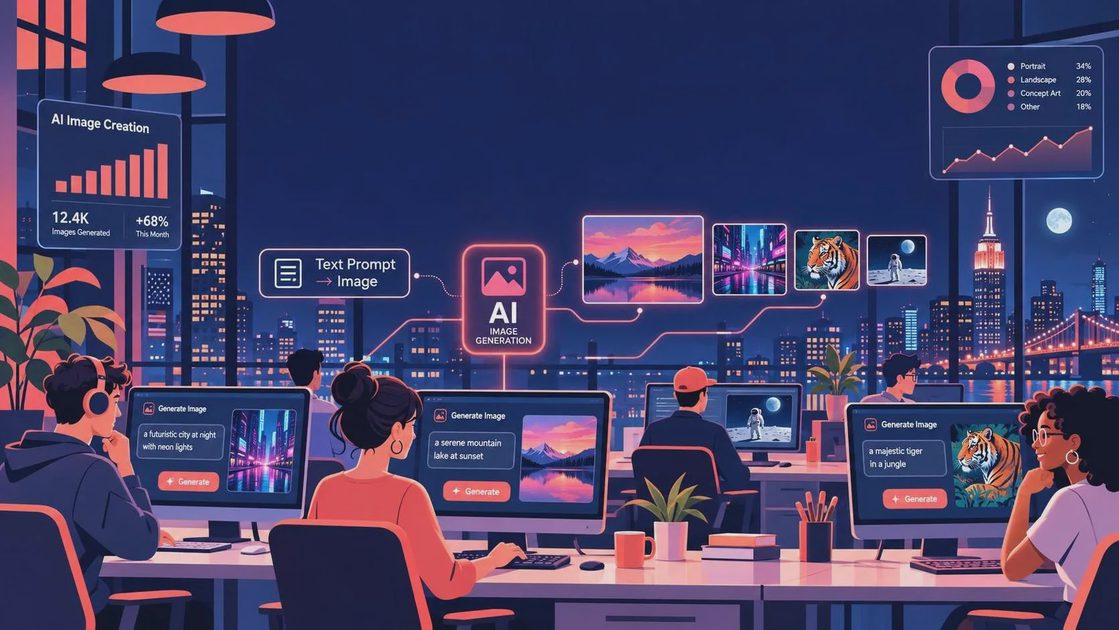
A text to image ai workflow becomes more reliable when the brief separates essentials from decoration. Essentials include the subject, camera view, orientation, lighting, materials, and placement. Decoration includes details such as a faint plant shadow, a particular paper texture, or a slightly imperfect handmade finish. If the first result is crowded, remove decoration before changing everything else.
Write prompts like a creative brief
Prompt writing does not need to sound technical. I usually build a prompt in layers. First comes the main subject and action. Next comes the environment and materials. Then I add composition, light, color, and output needs. The final sentence explains what should not happen, such as distorted packaging, extra objects, or a cropped product.
Here is a practical example: create a landscape product photograph of a matte green travel bottle standing on a pale stone counter, with a folded linen towel and one small branch in the background. Use soft window light from the left, a restrained sage and cream palette, realistic proportions, and generous negative space on the right for a headline. Keep the bottle label simple and centered; do not add extra bottles or busy props.
Notice what this prompt does not do. It does not demand twelve camera settings, a famous photographer’s name, or a pile of vague words such as stunning, epic, premium, and viral. Those words can point in different directions. Concrete visual instructions are easier to assess and revise.
With text to image ai, references can also help, provided you have permission to use them and understand what they communicate. A reference might establish a color relationship, a broad composition, or the feel of a material. It should support your direction rather than replace it. If you are working for a client, do not upload confidential materials or unreleased packaging without authorization.
Read the first result as evidence
The first generation is not a verdict. It is evidence about how the system interpreted your description. Look at it in a practical order. Is the main object recognizable? Are its proportions believable? Does the lighting support the mood? Is there enough usable space for text? Does the background compete with the subject?
When I test a text to image ai prompt, I save the first result even when it is a mess. One image might get the lighting right but lose the product shape. Another might create a convincing tabletop while turning the label into decorative scribbles. Saving both helps identify which instruction worked and which one needs more precision.
Change one major variable at a time. If the product is too small, ask for a closer crop and place it in the foreground. If the scene feels cold, change the light and surface before rewriting the entire prompt. If every revision introduces new clutter, explicitly request fewer props and a simpler background. Small edits make cause and effect easier to see.
A useful revision describes the problem without insulting the image. Instead of saying make it better, say preserve the green bottle’s shape, remove the second cup, reduce the contrast in the background, and leave the right third clear. That sentence gives the next generation a direction rather than a mood.
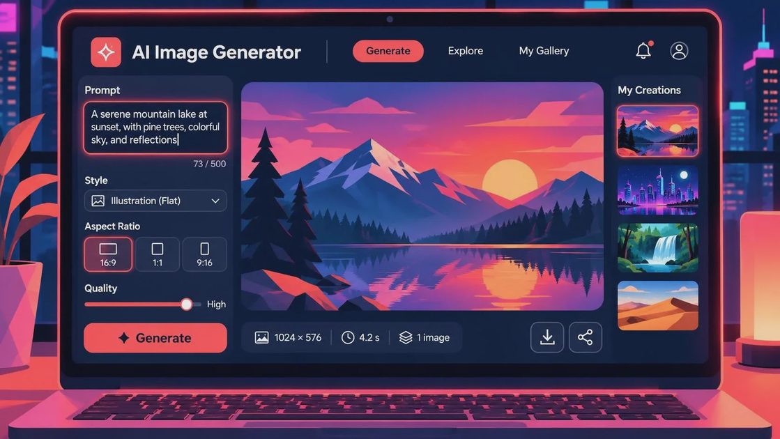
Use text to image ai for real design tasks
The tool is especially useful early in a project. A freelancer can create several art directions before presenting a client with a single polished route. A marketer can test whether a product scene feels bright, quiet, playful, or seasonal. A small business owner can explore a campaign concept before paying for a full shoot or illustration.
It is also useful for variations. Keep the subject and composition stable while changing the surface, season, palette, or audience. For a bakery concept, you might compare a warm kitchen counter with a clean editorial studio. For a skincare product, you might test water, stone, paper, and fabric without losing the central bottle placement.
That does not mean every generated image is ready to publish. Check logos, packaging text, hands, repeated patterns, reflections, and small objects. Generated lettering often needs to be replaced in a design program. Product claims should be written and approved separately. A strong workflow treats the image as a visual asset that still needs human review.
Common failures and useful fixes
When the image contains too many objects, the prompt is probably trying to solve too many problems at once. Remove half the props and describe the subject more clearly. When the style feels generic, add a specific material, location type, light direction, or layout constraint instead of another mood word.
When a face, hand, or product shape looks wrong, simplify the scene and request a closer view. Complex interactions are harder to control than a single subject with clear spacing. If the output keeps ignoring a key detail, move that detail earlier in the prompt and describe its position relative to something else.
A text to image ai result can also fail because the intended format was never stated. Say portrait, square, or landscape. Mention the approximate placement of the subject and where copy will go. A designer can fix color in post, but rescuing a cramped composition may require starting again.
Build a repeatable image habit
Create a small archive with the brief, prompt, first result, revision, and final selection. Add a short note explaining what changed. Over time, this becomes more valuable than a folder of random successful images because it shows how decisions produced outcomes.
I keep promising experiments in a folder named Maybe Later, including images that are not right yet but contain one useful idea. That habit prevents a failed generation from disappearing without teaching anything. It also makes future projects faster: you can borrow a proven structure while changing the subject.
The best text to image ai process is not a race toward one spectacular result. It is a practical loop: start with a sketch, generate a draft, inspect the evidence, revise one clear problem, and check the final image against its real purpose. Use the technology for exploration, keep your judgment involved, and let the image earn its way into the design.