
I still hear the phrase regularly. A client or collaborator looks at a first Image2.5 generation and says, “Can you just make it more beautiful?” or “Make it look premium.” The intention is understandable. The language is not useful. Image2.5 does not know what “beautiful” means for this specific product, this brand, or this channel. It only knows how to average toward polished defaults.
When the direction stays vague, the model fills the gaps with generic solutions: soft light, balanced composition, smoothed surfaces, and a pleasant but interchangeable mood. The result often looks finished and still fails the real job. This post explains why “make it beautiful” collapses as art direction and what to say instead. I will use a real packaging test I ran for a small skincare brand so the difference stays concrete.
What “beautiful” actually communicates to Image2.5
Almost nothing specific. The word carries emotion and preference but no measurable visual information. Image2.5 has been trained on millions of images that people have labeled or associated with positive qualities. When you ask for “beautiful,” you are mostly asking the model to lean toward those averaged positive patterns.
That produces familiar side effects:
Surfaces become smoother and slightly more reflective than the real material.
Lighting softens into safe, flattering defaults.
Proportions drift toward idealized rather than accurate.
Backgrounds grow generic and unobtrusive.
None of these changes are automatically wrong. They simply ignore the particular requirements of the assignment. A matte ceramic bottle that needs to look dry and tactile will often come back with a faint plastic sheen. A product that must show accurate scale will drift. A frame that needs open space for text will fill up with balanced but useless visual weight.
“Beautiful” is a reaction, not a direction. Art direction requires the latter.
A real example: the skincare bottle test
A small Portland skincare brand needed a clean product image of their new 50 ml matte glass serum bottle. The bottle has a soft-touch coating, a minimal label, and a distinctive low shoulder. The image had to work on the product page and in a simple Instagram square.
The first request I received was essentially “make it look beautiful and premium.”
I translated that into a prompt that stayed close to the vague language many people actually use:
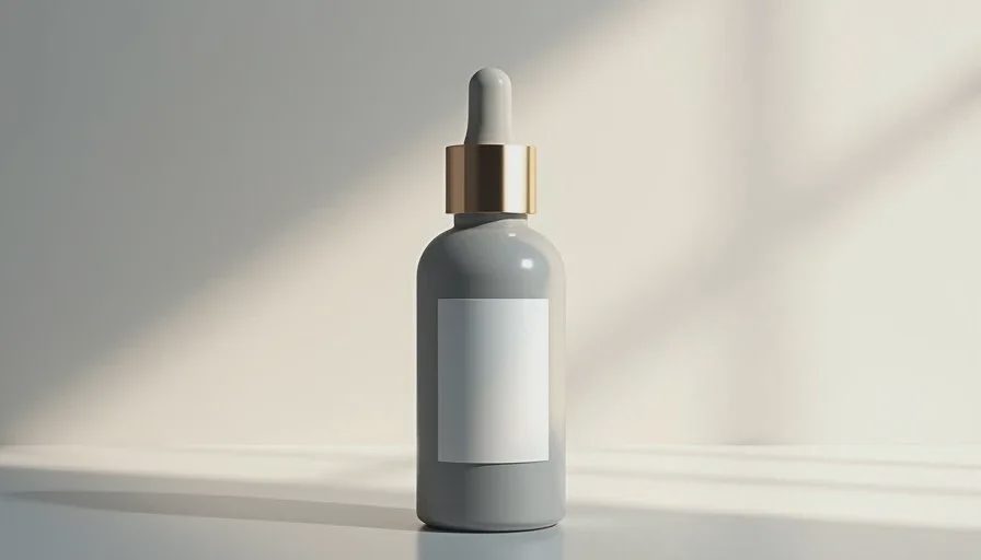
“Beautiful premium matte glass serum bottle on a clean surface, soft elegant light, high-end product photography”
The first generation looked polished. Soft gradient background, gentle highlights, pleasing overall tone. Three problems made it unusable:
The soft-touch coating had gained a subtle gloss.
The low shoulder of the bottle had been rounded into a more conventional shape.
The frame was tightly balanced with no comfortable space for the brand’s usual text treatment.
The image was “beautiful” by average standards and still wrong for the product and the channel.
Replacing vague language with visual decisions
I went back to the physical bottle and wrote a short brief that ignored the word “beautiful” entirely:
Subject: 50 ml matte glass serum bottle, soft-touch coating, distinctive low shoulder, minimal label
Must show: accurate shoulder line, dry soft-touch surface, readable label
Setting: light stone surface, soft side light from the left, no heavy props
Composition: bottle dominant, clean space on one side for text
Avoid: gloss, plastic shine, idealized proportions, busy background
The new prompt followed the brief directly:
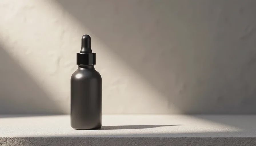
“50 ml matte glass serum bottle with soft-touch coating and low shoulder, dry non-reflective surface, minimal label, sitting on a light stone surface, soft side light from the left, clean product composition with open space on the right, accurate real proportions, no gloss, no plastic shine”
The second generation corrected the surface and the shoulder. The third small revision opened the right side of the frame. That version was approved.
The difference was not longer prompting. It was the replacement of a preference word with observable visual facts.
Language that actually moves Image2.5
After many tests, certain categories of language consistently produce more controllable results:
Shape and proportion statements: “low shoulder,” “cylindrical body,” “slightly tapered base”
Surface quality in physical terms: “dry soft-touch,” “matte with subtle texture,” “no specular highlights”
Lighting direction and quality: “soft side light from the left,” “cool daylight,” “gentle overhead diffusion”
Hierarchy and space: “product dominant in the left two-thirds,” “clean open right side for text”
Explicit exclusions: “no gloss,” “no heavy props,” “no idealized proportions”
These phrases give the model something concrete to execute and give you something concrete to evaluate. Preference words do neither.
I still use mood words, but only after the structural decisions are set. “Quiet” or “warm” can help once the shape, surface, light, and space are already defined. Used alone they are too soft to steer the result.
Why this matters beyond a single image
Vague direction creates two expensive problems. First, it multiplies generations. You keep asking for “more beautiful” or “more premium” and receive variations that are different but still not correct. Second, it trains the wrong habit. Teams start to believe that Image2.5 is unpredictable when the real issue is that the input lacked measurable criteria.
Clear visual language reverses both problems. Generations become fewer because evaluation becomes faster. The model starts to feel more consistent because you are finally giving it consistent instructions.
This is true for product work, social content, packaging concepts, and simple interiors. The subject changes; the need for specific direction does not.
A short replacement exercise
The next time you catch yourself about to write “make it beautiful” or “make it premium,” pause and answer four questions instead:
What exact shape or proportion must stay accurate?
What should the surface feel like in physical terms?
Where is the light coming from and how soft is it?
What space must remain open or protected in the frame?
Write the answers in plain language. Then build the prompt from those answers. Compare the new result to a generation that began with the vague request. The difference is usually obvious within one or two attempts.
I keep a running list of vague phrases that have failed me and the concrete replacements that worked. Over time the list becomes a personal reference that is more useful than any generic prompt library.
Image2.5 does not need to be told that an image should be beautiful. It needs to be told what the image must get right. When the direction is clear, the generations become far easier to guide and far more likely to be usable.
Start with the visual facts. The preference for beauty can follow once the facts are protected.