
Light is one of the fastest ways to change the feeling of an Image2.5 generation, and one of the easiest things to leave vague. Many prompts simply say “soft light,” “natural light,” or “studio lighting.” Those phrases produce pleasant defaults, yet they rarely match the specific mood or function the image needs. Soft light from the left creates a different result than soft light from above. Cool daylight behaves differently from warm window light at dusk. When the description stays general, Image2.5 fills in the gaps with averaged, safe choices.
This post shows how to describe light with enough clarity that the model can follow it and you can evaluate the result against a real intention. I will use a practical interior product test—a ceramic table lamp on a side table—so the difference between vague and specific language stays visible. The same principles apply to product shots, social visuals, and simple lifestyle frames.
Why most light descriptions fail
Image2.5 has seen millions of photographs with every kind of lighting. When you write only “soft natural light,” you are pointing at a very large average. The model tends to deliver a flattering, low-contrast, slightly warm illumination that looks finished and still feels generic. That default is useful for quick exploration. It is rarely precise enough for a final usable image.
Three pieces of information make the biggest difference:
Direction: where the primary light is coming from
Quality: how hard or soft the light is, and whether it has color temperature notes
Contrast and shadow behavior: how strong the shadows are and how they fall
Missing any of these leaves the model free to choose. The generation may look attractive and still miss the intended atmosphere or the practical needs of the frame (for example, readable product detail or open space for text).
A real test: the ceramic table lamp
A small lighting brand needed a quiet product image of a matte ceramic table lamp. The lamp has a simple cylindrical base and a linen shade. The image had to feel calm and residential, suitable for both the product page and a lifestyle Instagram post.
The first prompt used the kind of language I still see often:
“Matte ceramic table lamp with linen shade on a wooden side table, soft natural light, calm interior product photography”
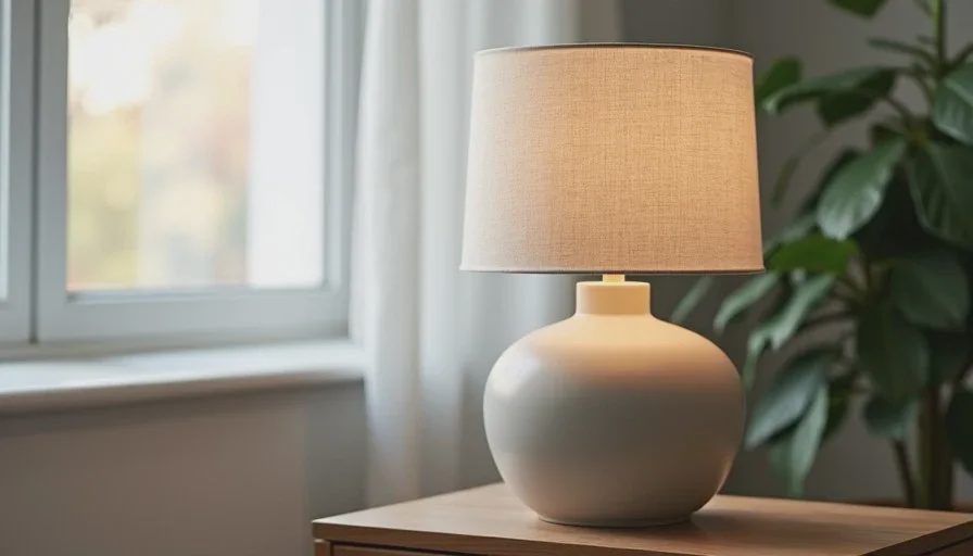
The first generation was pleasant. Soft overall illumination, clean composition, no harsh shadows. Two problems appeared immediately:
The light direction was undefined, so the shade and base lacked clear form.
The contrast was so low that the matte ceramic surface lost tactile quality and the linen texture flattened.
The image looked “nicely lit” and still failed to show the product clearly.
Adding direction, quality, and shadow behavior
I rewrote the light portion of the prompt with three concrete decisions:
Direction: soft window light from the left
Quality: diffused daylight, slightly cool
Shadow behavior: gentle shadows that still define the cylindrical base and the shade’s edge
New prompt:
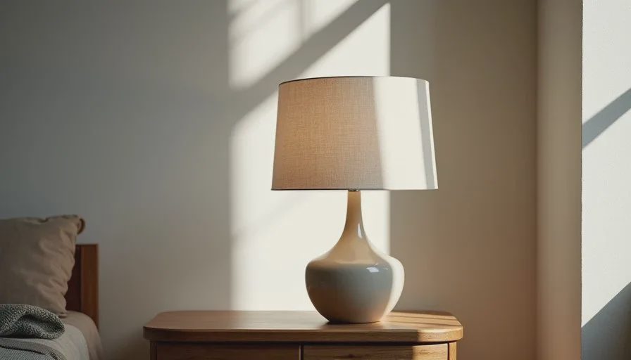
“Matte ceramic table lamp with linen shade on a wooden side table, soft diffused window light from the left, slightly cool daylight, gentle shadows that define the cylindrical base and shade edge, calm residential interior, clean product composition”
The second generation immediately improved. The left-side light created clear form on the base and a soft gradient across the shade. The ceramic surface regained a sense of dryness and volume. A small third revision adjusted the shadow strength so the darkest areas did not hide the lower base. That version was approved.
The change was not longer description. It was the addition of direction, quality, and observable shadow behavior.
Practical language that works for light
After repeated tests, certain phrases consistently give Image2.5 clearer instructions:
Direction examples
soft window light from the left
overhead diffused light
low side light from the right
three-quarter light from the front left
Quality examples
soft diffused daylight
slightly warm late-afternoon light
cool overcast daylight
gentle studio softbox quality
Shadow and contrast examples
gentle shadows that still define form
low contrast with soft shadow edges
moderate contrast with visible but soft shadows
open shadows, no deep black areas
I also find it useful to name what the light should reveal. “Soft light that shows the dry texture of the ceramic” or “side light that keeps the label readable” ties the illumination to the purpose of the image.
Color temperature can be mentioned lightly when it matters—“slightly cool” or “warm window light”—but extreme temperature words sometimes push the model into stylized results. I use them sparingly and check the output carefully.
Common light mistakes and simple fixes
A few habits keep producing generic results:
Using only mood words (“beautiful light,” “dreamy light,” “cinematic light”). These are preferences, not instructions. Replace them with direction and quality.
Describing light without checking the product’s needs. A matte surface often benefits from side light that reveals texture. A glossy surface may need more controlled highlights. Let the material guide the light description.
Changing light and subject description at the same time. When a generation fails, adjust only the light language first. That makes it easier to see what actually improved.
Ignoring the final use of the image. Social frames that need text space often work better with even, soft light that does not create strong directional drama. Product-page images may need clearer form. Match the light to the job.
A short practice method
Take any simple object near you and run three quick tests:
Generate with only “soft natural light.”
Generate with a clear direction added (“soft window light from the left”).
Generate with direction plus quality and shadow note (“soft diffused window light from the left, gentle shadows that define form”).
Compare the three results side by side. The increase in control is usually visible within those three frames. Repeat the exercise with a different object and a different direction. The pattern becomes easy to recognize.
I keep a small reference list of light phrases that have worked for the kinds of images I make most often—product, quiet interior, social lifestyle. The list is more useful than any generic “cinematic lighting” collection because it is tied to results I have already evaluated.
What clear light description changes
The most immediate change is predictability. When direction, quality, and shadow behavior are stated, the generations vary less wildly and stay closer to the intended mood. Evaluation also becomes faster. Instead of asking whether the light “feels right,” you can ask whether the light is coming from the stated direction and whether the shadows are doing the work you described.
Image2.5 remains capable of beautiful defaults. Those defaults are a starting point, not a destination. When you need the image to serve a specific product, brand, or channel, clear light language is one of the highest-leverage improvements you can make to a prompt.
Describe where the light comes from, how soft or hard it is, and what the shadows should do. The model has far more to work with, and you have far clearer criteria for deciding whether the result is usable.