
One of the most consistent complaints I hear about Image2.5 product work is the plastic look. A matte ceramic vase comes back with a faint shine. A kraft paper bag gains a subtle sheen. A linen shade looks slightly synthetic. The overall image can still feel polished, yet the material no longer matches the real object. Customers notice. Designers notice. The image becomes harder to use.
This problem is not random. Image2.5 tends to smooth surfaces and increase specular response unless the prompt actively protects the intended finish. Vague words such as “realistic material” or “high-quality texture” rarely stop the drift. Specific physical language does.
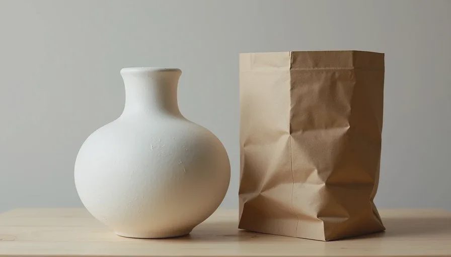
This post walks through the exact phrasing I use to keep materials honest. I will use a side-by-side test of a matte ceramic vase and a kraft paper packaging sample so the difference between weak and strong material description stays clear. The same approach works for wood, fabric, stone, and coated paper.

Why materials drift toward plastic
Image2.5 has been trained on a huge range of product photography, much of it retouched and idealized. When the prompt does not constrain surface behavior, the model often defaults to smoother, slightly more reflective finishes. Matte becomes satin. Dry becomes softly glossy. Subtle texture disappears.
Three factors make the drift worse:
Using only the material name (“ceramic,” “paper,” “wood”) without surface quality
Adding positive but vague adjectives (“beautiful,” “premium,” “realistic”)
Omitting explicit negative instructions about gloss or plastic appearance
The model is not ignoring you. It is filling in missing information with averaged, polished defaults. Clear surface language reduces that freedom.
A practical test: ceramic vase and kraft sleeve
A small home-goods brand needed two simple images: a matte white ceramic vase and a kraft paper sleeve that wraps a candle. Both materials are dry and tactile in real life. Both frequently turn plastic in early Image2.5 generations.
First prompt for the vase (typical weak version):
“Matte white ceramic vase on a light wood surface, soft side light, realistic ceramic material, clean product photography”
The result looked refined. Soft light, clean shape. The surface, however, had a low-level specular sheen that made the ceramic read as coated plastic. Texture was almost gone.
First prompt for the kraft sleeve:
“Kraft paper sleeve on a wooden table, natural light, realistic paper texture, product style”
The paper gained a slight waxy finish and lost the dry fiber quality of real kraft.
Both images were attractive and both were wrong for the brand.
Language that protects real surface quality
I rewrote both prompts with three layers of material description:
Base material + finish type
Physical surface behavior
Explicit exclusion of the unwanted look
Ceramic vase revised prompt:
“Matte white ceramic vase with dry non-reflective surface and subtle texture variation, soft side light from the left, light wood surface, clean product photography, no gloss, no plastic shine, no specular highlights”
Kraft sleeve revised prompt:
“Dry kraft paper sleeve with visible fiber texture and matte uncoated finish, soft natural side light, wooden table, clean product style, no waxy sheen, no plastic look, no smooth coating”
The new generations corrected the problem. The ceramic stayed dry and slightly chalky. The kraft showed fiber and stayed uncoated. A small further revision on the vase added “soft tactile quality” to reinforce the hand-feel without introducing shine.
The improvement came from physical description plus clear negatives, not from longer poetic language.
Useful material phrases by category
After many tests I keep a short working list for the materials I encounter most often.
Ceramic and stoneware
dry matte glaze
non-reflective soft-touch surface
subtle texture variation
no gloss, no plastic shine
Uncoated paper and kraft
dry fiber texture
matte uncoated finish
visible paper grain
no waxy sheen, no smooth coating
Wood
natural wood grain with dry matte finish
open pore texture
no polished varnish look
Linen and cotton fabrics
dry woven texture
soft matte fabric surface
visible thread variation
no synthetic sheen
Soft-touch coatings
dry soft-touch coating
non-specular rubberized feel
no plastic gloss
I place the strongest material language early in the prompt and repeat the key negative (“no plastic shine” or “no gloss”) near the end. Image2.5 seems to respond well to that sandwich.
Common mistakes that reintroduce the plastic look
Even with good intentions, a few habits undo the work:
Adding “premium” or “high-end” without surface constraints. These words often increase smoothing and reflectivity.
Describing only color and shape. “White ceramic vase” is not enough. The finish must be stated.
Changing lighting and material language at the same time. When a surface fails, lock the light and revise only the material description. That isolates the cause.
Trusting a single generation. Material behavior can vary. I usually run two or three versions with the same strong material language and select the most honest surface.
A quick diagnostic method
When a generation looks plastic, ask three questions:
Did I name the finish in physical terms (dry, matte, uncoated, non-reflective)?
Did I describe any visible texture or variation?
Did I explicitly exclude gloss, shine, or plastic appearance?
If any answer is no, that is the first place to revise. Most plastic-looking results improve within one or two targeted edits.
I also keep side-by-side reference images of the real object and the best Image2.5 version. The comparison makes the remaining gaps obvious and prevents me from accepting a “good enough” surface that still feels synthetic.
What changes when material language is precise
The most useful change is trust. When the surface stays honest, the rest of the image becomes easier to approve. Clients stop asking why the product looks coated. The image works harder for e-commerce and social use because it matches the physical item more closely.
Image2.5 is capable of convincing material rendering. It simply needs clearer instructions about the finish you actually want. Name the surface in physical terms, describe the texture that should remain visible, and exclude the plastic qualities you do not want. The generations become noticeably more reliable.
Start with the real material in front of you. Describe what you see and what you do not want to see. The model has far less room to drift.