
Most Image2.5 product generations that feel “almost right” fail for a small number of repeatable reasons: proportions drift, materials turn plastic, light flattens form, scale feels wrong, or the main subject loses hierarchy. The good news is that these problems rarely require a completely new prompt. Targeted changes to the existing language often fix them within one or two generations.
This post walks through a single product test—a matte black ceramic pour-over kettle—and shows the five specific prompt changes that moved the image from unusable to client-ready. Each change is small, deliberate, and tied to a clear visual problem. You can reuse the same thinking on almost any product assignment.
The starting point: a typical weak generation
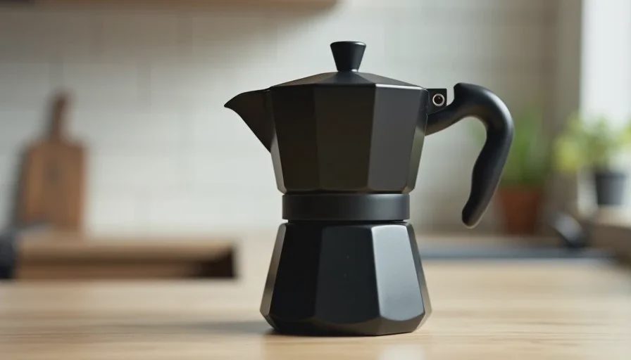
The client needed a clean product image of a matte black ceramic pour-over kettle for their online shop and Instagram. The kettle has a distinctive wide base, a gooseneck spout, and a dry matte glaze. The first prompt was the kind of language many people start with:
“Matte black ceramic pour-over kettle on a light wood surface, soft natural light, realistic product photography, clean composition”
The first result looked polished at a glance. Soft light, simple background, decent overall shape. Five problems made it unusable:
The base was too narrow, changing the real silhouette.
The matte glaze had a faint plastic sheen.
The light was so even that the cylindrical body lost volume.
The kettle felt slightly small in the frame, as if it lacked real weight.
The spout and handle competed equally with the body, so the eye had no clear entry point.
Any one of these issues might have been tolerable. Together they made the image feel like a generic 3D render rather than a photograph of a real object.
Change 1: Lock the key proportions early
I added explicit shape language at the beginning of the prompt:
“Matte black ceramic pour-over kettle with wide stable base, tall cylindrical body, and long gooseneck spout...”
Naming the wide base and the relationship between body and spout immediately improved the silhouette. Image2.5 responds strongly to early structural descriptions. When proportions are left general, the model averages toward more conventional shapes.
Change 2: Protect the surface with physical language and a negative
The plastic sheen disappeared once I replaced “matte black ceramic” with stronger surface terms and an explicit exclusion:
“...dry matte black ceramic glaze with subtle texture variation, no gloss, no plastic shine, no specular highlights...”
“Dry,” “subtle texture variation,” and the three negatives gave the model clear boundaries. Vague “matte” or “realistic ceramic” is usually not enough to stop the smoothing tendency.
Change 3: Give the light a direction and a job
Even illumination flattened the form. I changed the light description to:
“soft window light from the left creating gentle shadows that define the cylindrical body and the curve of the spout”
Direction plus a short statement of what the light should reveal restored volume. The body gained a clear light-to-shadow transition and the spout became easier to read.
Change 4: Correct the sense of scale and presence
The kettle still felt slightly toy-like. I added a simple scale cue and a presence note:
“real-world scale, solid and grounded on the surface, not floating or miniature”
Image2.5 sometimes shrinks or lightens objects when the prompt does not anchor them. Explicit “real-world scale” and “solid and grounded” language helps the model keep the object’s weight.
Change 5: Establish clear hierarchy
Finally I told the model what should dominate the frame:
“kettle body dominant in the composition, spout and handle secondary but clearly visible, clean open space around the object”
This reduced the visual competition between parts and gave the image a clearer focal order. The eye now entered on the body and moved naturally to the spout.
The revised prompt that worked
After the five changes the full prompt read:
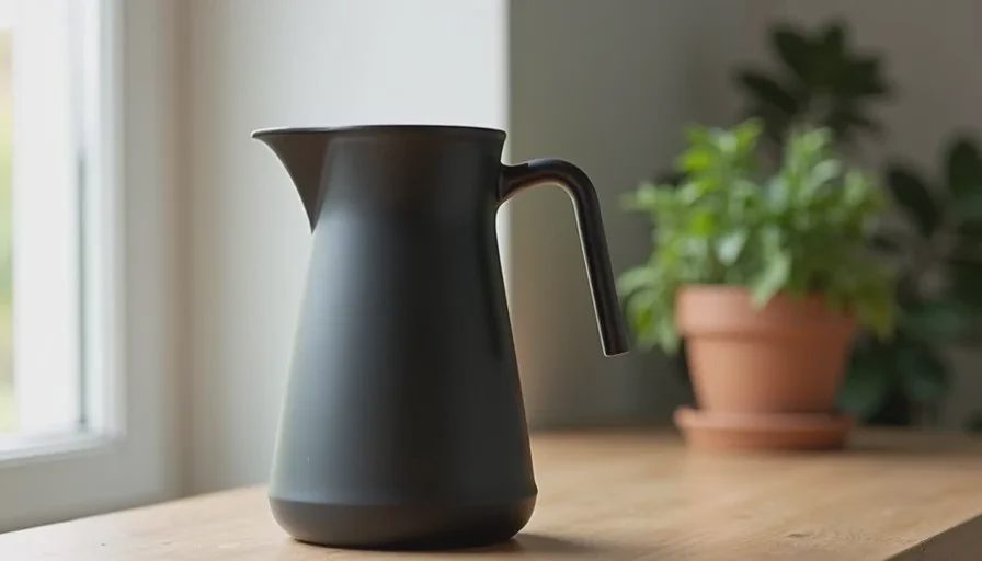
“Matte black ceramic pour-over kettle with wide stable base, tall cylindrical body and long gooseneck spout, dry matte black ceramic glaze with subtle texture variation, no gloss, no plastic shine, no specular highlights, soft window light from the left creating gentle shadows that define the cylindrical body and the curve of the spout, real-world scale, solid and grounded on a light wood surface, kettle body dominant in the composition, spout and handle secondary but clearly visible, clean open space around the object, clean product photography”
The next generation solved all five problems. Proportions matched the real kettle, the surface stayed dry, the light shaped the form, the object felt substantial, and the hierarchy was clear. A minor sixth generation only adjusted the exact crop. That version was approved.
Why small changes outperform full rewrites
When a generation is already close, rewriting the entire prompt often introduces new problems while trying to fix old ones. Targeted edits keep the successful parts stable and let you see the effect of each change. This is especially useful with Image2.5, where small shifts in language can produce noticeable differences in surface, light, and proportion.
I keep a short checklist for product work:
Are the key proportions named early?
Is the surface described in physical terms with explicit negatives?
Does the light have direction and a clear job?
Is real-world scale and presence stated?
Is visual hierarchy defined?
Most weak product images fail on two or three of these points. Fixing them in sequence is faster than starting over.
How to apply the same five changes to other products
The exact words will change, but the categories stay useful.
For a glass bottle you might lock the shoulder line, protect the clarity and refraction, give the light a direction that reveals the liquid or the glass thickness, anchor the scale, and decide whether the bottle or the label dominates.
For a fabric bag you might name the proportions of the body and handles, describe the dry woven texture and exclude synthetic sheen, use soft side light to show the folds, keep real-world scale, and decide whether the bag body or an open top is the primary focus.
The five categories—proportion, material, light, scale, hierarchy—cover the majority of believability problems I see in product work with Image2.5.
What believable actually means here
Believable does not mean perfect photographic realism. It means the image communicates the real object’s shape, surface character, and presence clearly enough that a customer or collaborator can trust it. When those elements are protected, the image becomes useful for e-commerce, social, and presentation work.
Image2.5 can produce that level of clarity once the prompt stops leaving the critical decisions to default averages. Make the five changes deliberately. Evaluate after each one when possible. The path from “almost right” to “usable” is usually shorter than it first appears.