Interior scenes are one of the most requested uses for Image2.5 among designers, small brands, and content creators. A single image can suggest a product in context, explore a mood, or support a social post. The generations often look attractive at first glance. Closer inspection frequently reveals problems with scale, material honesty, spatial logic, or lighting that does not match the described conditions.
I ran a structured accuracy test to measure how Image2.5 currently handles interior scenes under realistic constraints. The test used three common scenarios: a simple living-room corner with a ceramic lamp, a kitchen counter vignette with a pour-over setup, and a small café table scene. This post shows the briefs, the first results, the recurring accuracy issues, and the specific prompt adjustments that produced more reliable frames.
Test setup and evaluation criteria
Each scene received a short brief that locked four accuracy requirements:
Correct relative scale between objects
Honest material response (no plastic sheen on ceramic, wood, or fabric)
Believable spatial relationships and perspective
Lighting direction and quality that matched the description
I evaluated every generation against those four points rather than against general attractiveness. An image could look polished and still fail the test if scale, material, space, or light did not hold.
No external control tools or reference images were used. The results reflect what plain prompt language can currently achieve.
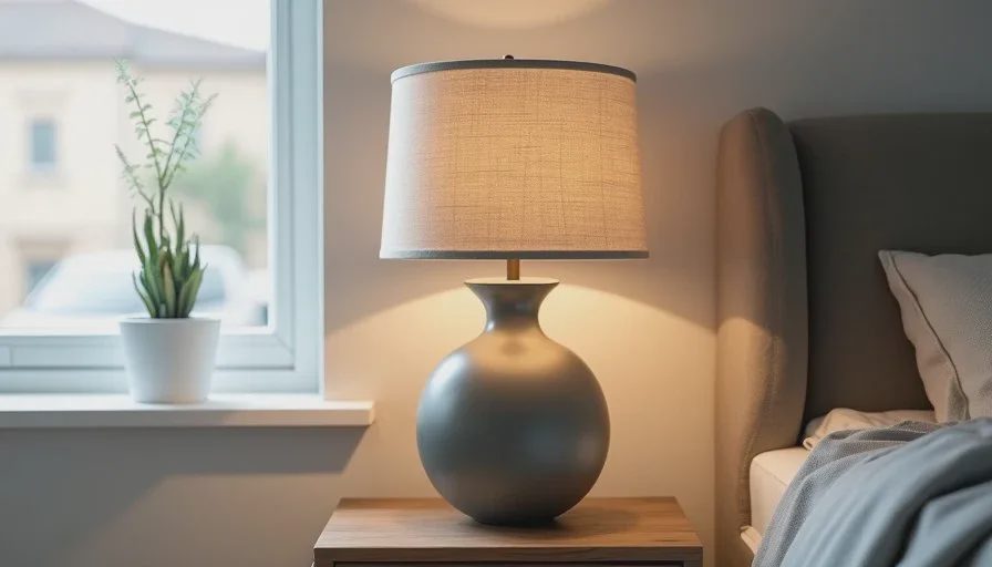
Scene 1: Living-room corner with ceramic lamp
Brief summary:
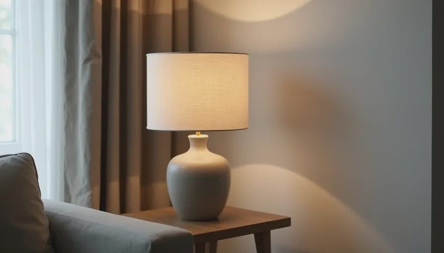
Matte ceramic table lamp with linen shade on a wooden side table, soft window light from the left, simple residential corner, accurate lamp proportions, dry ceramic and fabric surfaces.
First generations produced three consistent problems:
The lamp base often appeared too slender or too tall relative to the shade
The ceramic surface gained a soft specular sheen
The side table surface sometimes tilted or lost consistent perspective with the wall
When I added explicit proportion language (“accurate real-world proportions for a table lamp, cylindrical base supporting a properly scaled linen shade”), reinforced the material (“dry matte ceramic, no gloss, dry woven linen”), and stated the light direction again, the failures decreased. Scale and surface improved most. Perspective still required occasional extra generations to stabilize.
Scene 2: Kitchen counter pour-over vignette
Brief summary:
Matte white ceramic pour-over dripper and kettle on a light kitchen counter, soft morning side light, clean residential kitchen, correct object scale, dry ceramic surfaces, believable counter depth.
Early results looked inviting. Accuracy issues appeared quickly:
The dripper and kettle frequently changed relative size
Counter depth collapsed or stretched
Ceramic surfaces trended toward a slight plastic finish
Shadows sometimes fell in directions that contradicted the described window light
Locking both objects with the same detailed product language used in earlier product tests, adding “consistent real-world scale between dripper and kettle,” and repeating the light direction reduced the worst scale and material drifts. Spatial depth of the counter remained the most stubborn problem and improved only partially.
Scene 3: Small café table
Brief summary:
Simple café table with a ceramic cup and a small plate, warm side light, quiet interior corner, accurate cup proportions, dry ceramic, believable table surface and perspective.
This scene showed the same pattern at a smaller scale. Cup proportions drifted, the table surface sometimes warped, and the ceramic picked up unwanted sheen. Warm light was easy to achieve; consistent perspective and material honesty were not.
Reinforcing proportion, material negatives, and light direction again produced the largest gains. The final usable frames still required selection among several variations.
Recurring accuracy patterns
Across all three interior scenes the same categories of error appeared:
Scale relationships between objects are fragile and need explicit locking
Matte and dry materials trend toward soft gloss unless actively protected
Perspective and surface planes (tables, counters, shelves) can warp or lose consistency
Lighting mood is easier to achieve than precise lighting direction and shadow logic
Attractive overall composition and pleasant atmosphere were rarely the problem. The failures clustered around the measurable accuracy points that matter for professional or commercial use.
Prompt adjustments that improved results
Four types of language produced the most reliable improvements:
Explicit real-world scale and proportion statements for every key object
Physical material descriptions paired with clear negatives (“dry matte ceramic, no gloss, no plastic shine”)
Repeated lighting direction and a short note about what the light should reveal
Simple spatial anchors (“level wooden table surface, consistent perspective, believable depth”)
Placing the strongest accuracy constraints early in the prompt and repeating the two or three most fragile points near the end helped more than simply lengthening the description. Generating a small batch and selecting the most accurate frame remained more efficient than chasing perfection in a single generation.
Practical recommendations for interior work
When using Image2.5 for interior scenes that must feel accurate rather than purely atmospheric, I now follow a short checklist:
List every object that must keep correct scale and write proportion language for each
Protect every matte or dry material with physical terms and negatives
State light direction twice if the scene depends on it
Accept that perspective and surface planes may still need multiple attempts
Evaluate at the final intended size, not only at thumbnail scale
For mood boards and early exploration, the current accuracy level is often sufficient. For client-facing product-in-context images or any frame that must support design decisions, the extra constraint language and selection step are still necessary.
What the test suggests about current capabilities
Image2.5 can generate interior scenes that feel coherent and visually appealing with relatively little effort. It does not yet maintain precise scale, material honesty, and spatial logic automatically. Those qualities remain under the control of clear prompt constraints and careful human evaluation.
The gap is workable. With deliberate language for proportion, surface, light, and space, the model produces frames that are usable for many real projects. The key is to treat accuracy as an active requirement rather than an expected default.
Interior scenes will continue to be a major use case for Image2.5. Understanding where the model currently drifts—and how to anchor the details that matter—makes the difference between pretty generations and images that can actually support design and commercial work.