Text and packaging details remain one of the most common pain points when using Image2.5 for product work. A generation can look polished overall, yet the label text is warped, the logo is invented, or the packaging structure drifts just enough to feel wrong. For anyone creating images for e-commerce, social ads, or packaging concepts, these failures are not minor. They decide whether the image can ship or must be discarded.
I ran a focused test to measure how Image2.5 currently handles three related tasks: short readable text on labels, accurate packaging structure, and consistency of printed details across simple variations. The test used real product types I work with often—a skincare bottle, a coffee bag, and a simple folding carton. This post shows the setup, the results, the patterns that kept appearing, and the practical steps that improved readability and structure without requiring advanced tools.

Test design and rules
I chose three common packaging types and gave each a short, realistic brief:
Matte glass skincare bottle with a minimal white label containing the product name and a short ingredient line
Kraft coffee bag with a simple black printed label
Small folding carton with front-panel text and a clean side panel
For every generation I locked the same core instructions:
Exact product shape and material
Specific short text that must remain readable
No invented logos or extra decorative type
Clean product-style lighting and composition
I did not use any external text-rendering tools or post-processing. The goal was to see what plain Image2.5 prompting can currently deliver.
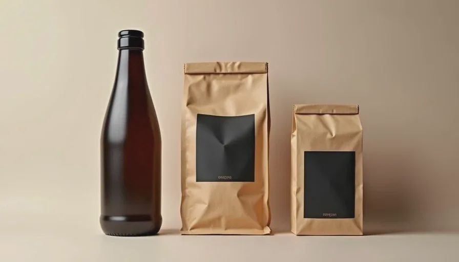
Result set 1: skincare bottle label
The brief asked for a 50 ml matte glass bottle with a white label reading “Daily Serum” on the first line and a short second line of ingredients. Early generations produced three recurring problems:
Letter shapes distorted or merged
Text baseline curved or tilted
Extra decorative lines or invented symbols appearing near the real text
When I shortened the text to only two words and added the phrase “clearly readable clean sans-serif text, no distortion, no extra characters,” readability improved. The letters became more stable, though still not perfect under close inspection. Longer ingredient lines continued to break more often than short names.
Result set 2: kraft coffee bag
The coffee bag test used a simple black label with the roast name and a one-line tasting note. Image2.5 handled the bag structure reasonably well once proportions were locked. Text performance was mixed. Short roast names (two or three words) stayed mostly legible. The tasting note line frequently warped, dropped characters, or gained slight perspective distortion that made it hard to read at a glance.
Adding explicit instructions—“flat readable label text, no perspective warp, no missing letters”—reduced the worst failures. It did not eliminate them. In several frames the text looked acceptable at thumbnail size but failed when viewed at the size needed for a product page.
Result set 3: folding carton
The folding carton exposed structural issues more clearly than pure text problems. Early generations changed the box proportions, softened the fold lines, or added extra panels. When text was placed on the front panel, the model sometimes curved the type to follow an imagined surface or invented secondary graphics.
Reinforcing both structure and text in the same prompt helped:
“accurate rectangular folding carton with clean sharp fold lines, flat front panel, clearly readable short product name in clean sans-serif, no extra graphics, no warped text”
The combination of structural anchors and text constraints produced the most usable frames in this set. Even then, very small text remained unreliable.
Patterns that kept repeating
Across all three packaging types a few consistent behaviors appeared:
Short text (one to three words) survives far more often than longer lines.
Clean, high-contrast labels perform better than low-contrast or highly styled type.
Explicit negatives about distortion, missing characters, and invented elements reduce failures but do not remove them.
Packaging structure (box edges, bag proportions, bottle shoulders) drifts unless named early and reinforced.
Text that must sit on a curved or angled surface fails more often than text on a flat panel.
These patterns match what many practitioners already observe. The test simply made the frequency and severity clearer under controlled conditions.
What improved results most
Three prompt adjustments produced the largest practical gains:
Keep required text extremely short and place it early in the prompt.
Add direct readability language: “clearly readable, no distortion, no missing letters, no extra characters.”
Lock packaging structure with the same precision used for product proportions—“accurate rectangular carton with sharp fold lines” or “flat kraft bag with precise front panel.”
Running two or three variations with the same strong constraints and then selecting the cleanest text usually worked better than endless single-generation attempts. I also found it useful to generate a version with no text first to lock the packaging form, then add the text instruction in a follow-up generation when possible.
Realistic expectations for current work
Image2.5 can produce packaging images that are usable for mood boards, early concepts, and some social content where exact text is secondary. For final e-commerce hero images or any placement where customers must read the label, the text still requires careful checking and often manual correction or external compositing.
The model is stronger at overall packaging presence and material suggestion than at precise typography. That division is important for planning. Use Image2.5 to explore structure, lighting, and material quickly. Treat final readable text as a separate step that may need additional tools or human cleanup.
A short practical checklist
When a project involves labels or packaging text, I now run through this list before generating:
Can the required text be shortened without losing meaning?
Have I named both the packaging structure and the text readability requirements?
Are there explicit negatives for distortion, missing characters, and invented graphics?
Am I evaluating the text at the actual size it will be seen, not just at thumbnail scale?
Is this image intended for final use or for concept exploration?
Answering those questions early prevents most of the wasted generations I used to produce.
Image2.5 continues to improve, yet text and fine packaging details remain areas where human oversight is still essential. Clear constraints, short required text, and strict evaluation against readability standards currently give the most reliable path to usable results. The model can support the visual exploration; the final judgment about whether a customer can actually read the label still sits with the person directing the work.