Most Image2.5 examples online start with a clean, idealized prompt. Real small-business work rarely does. The brief arrives messy, the product has constraints, the channel has rules, and the budget does not allow endless generations. I wanted to see how Image2.5 performed under those conditions.
This test used an actual brief from a Portland coffee roaster who needed a single ad image for Instagram and a simple website banner. The product was their new seasonal blend in a matte kraft bag. The image had to show the bag clearly, feel warm and local, leave space for short text, and avoid looking like generic stock. I treated the assignment exactly as I would for a paying client: one clear brief, limited revisions, and a hard stop when the image became usable.
The real brief
The client’s request, lightly cleaned for clarity, read:
Product: 12 oz matte kraft coffee bag with simple black label, front-facing
Must show: bag shape, readable label, matte paper texture
Setting: warm, approachable, slightly rustic but clean
Channel: Instagram feed + website banner (text will be added later)
Mood: local, seasonal, not corporate
Avoid: glossy bag, dark moody café clichés, busy props, anything that feels stock
That was the entire creative direction. No mood boards, no reference images, no extra style notes. This is typical for many small-business projects.
First prompt and first generation
I translated the brief as directly as possible:
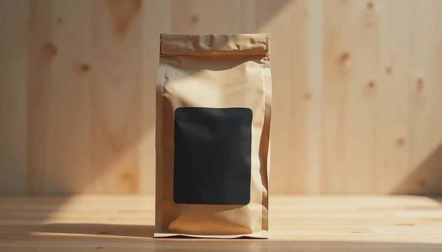
“12 oz matte kraft coffee bag with simple black label, front-facing, on a light wooden surface, warm soft side light, clean approachable product style, readable label, open space for text, no glossy finish, no busy props”
The first generation was attractive. Soft warm light, pleasant wood texture, overall inviting mood. Three problems appeared immediately when measured against the brief:
The bag proportions were slightly tall and narrow, changing the real silhouette.
The kraft surface had picked up a low waxy sheen.
The lower third of the frame was too busy with wood grain and shadow, leaving little clean space for the text the client planned to add.
The image looked like a professional product shot. It did not yet meet the practical requirements of the ad.
Revision round one: proportions and surface
I kept the successful parts of the prompt and addressed the two material and shape failures:
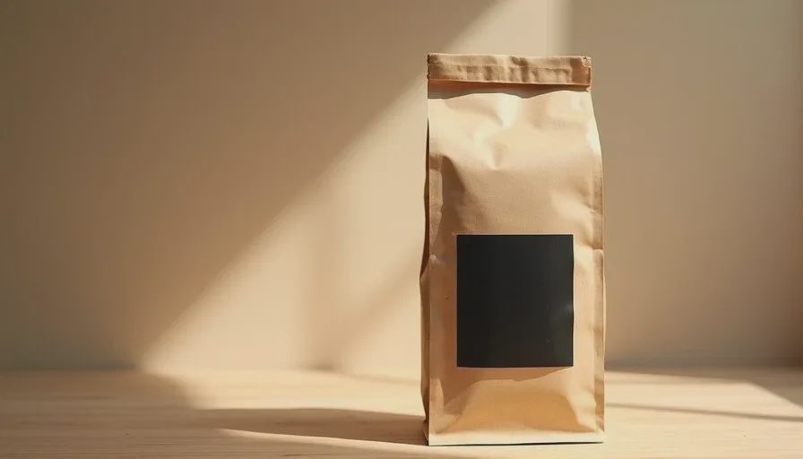
“12 oz matte kraft coffee bag with accurate real proportions, simple black label, front-facing, dry uncoated kraft paper texture with visible fiber, no waxy sheen, no plastic look, on a light wooden surface, warm soft side light from the left, clean approachable product style, readable label”
The second generation corrected the bag shape and removed most of the sheen. The kraft now read as dry paper. Label legibility improved. The text-space problem remained.
Revision round two: protecting the text zone
I added explicit composition language:
“...bag dominant in the upper two-thirds of the frame, clean open lower third with minimal texture and even light for text overlay, no heavy shadows in the text area”
The third generation solved the layout. The bag sat higher, the lower third stayed relatively clean, and the overall mood remained warm and approachable. A fourth minor generation only adjusted the exact crop and the warmth of the light by a small amount. That version was delivered to the client.
Total generations used: four. Time from brief to usable file: under an hour of active work.
What Image2.5 handled well
Several parts of the assignment played to the model’s strengths:
Warm, soft side lighting landed convincingly on the first try.
The overall “approachable local” mood was easy to reach once the brief was clear.
Basic product presence and clean background separation required little effort.
These are the areas where Image2.5 currently saves the most time for small-business work.
What still required human correction
Three elements needed active protection:
Exact bag proportions
Dry, uncoated paper surface
Practical space for later text
None of these are exotic. They are simply the details that determine whether an image can actually ship. Image2.5 does not yet prioritize them automatically when the prompt stays general.
Lessons for small-business ad work
A few patterns from this test apply to many similar projects:
Write the brief in constraints, not adjectives. “Matte kraft, readable label, open lower third, no gloss” is more useful than “beautiful premium coffee bag.”
Protect the two or three details that will kill the image if they fail. In this case it was shape, surface, and text space.
Treat the first generation as a diagnostic, not a candidate. Look for the specific failures, then revise only those points.
Stop when the image meets the brief. Further polishing often introduces new problems while the deadline and budget keep moving.
Keep the final use visible during evaluation. An image that looks perfect in isolation can still fail once real text and platform cropping are applied.
A practical workflow extracted from the test
Receive or write a short constraint-based brief.
Translate it into a first prompt that stays close to those constraints.
Generate once and list the concrete failures against the brief.
Revise only the failing elements.
Check the new result against both the brief and the real channel requirements (text space, crop, mood).
Deliver when the image is usable; archive the near-misses for the next similar job.
This sequence kept the test efficient and produced a file the client could actually run.
Image2.5 is already capable of supporting real small-business ad work. It performs best when the brief is specific, the evaluation is strict, and the revisions stay targeted. The model supplies speed and a strong visual starting point. The human still supplies the judgment about whether the image will function in the real channel for the real audience.
That division of labor is where the tool currently delivers the most value.