Restaurants need a steady flow of visuals for menus, social posts, seasonal promotions, and website updates. Full photo shoots are expensive and slow. Image2.5 offers a faster option for certain tasks, yet it also has clear limits that matter when the images represent real food, real spaces, and a real brand.
This post examines what Image2.5 currently does well for restaurant marketing and where it falls short. The observations come from tests and small projects with independent cafés, casual restaurants, and one seasonal pop-up. The goal is practical guidance rather than hype: which jobs the tool can support today, and which jobs still need photography, food styling, or graphic design.
Where Image2.5 is already useful
Three areas consistently produce usable results for restaurant work.
Menu and dish concept exploration
When a chef or owner wants to visualize a new plate before committing to ingredients or plating style, Image2.5 can generate quick directional frames. These are not final menu photos. They are decision tools that help compare composition, color balance, and overall mood.
Social media ambiance and setting frames
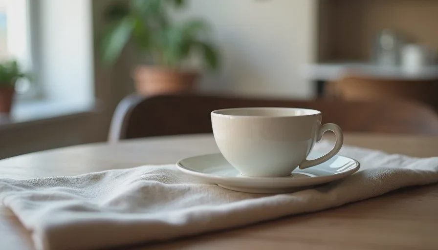
Empty or lightly dressed interior corners, table settings, and simple lifestyle contexts often come out coherent enough for story backgrounds or secondary feed posts. Soft window light, wood tables, and quiet café atmospheres are among the stronger categories.
Seasonal and promotional mood images
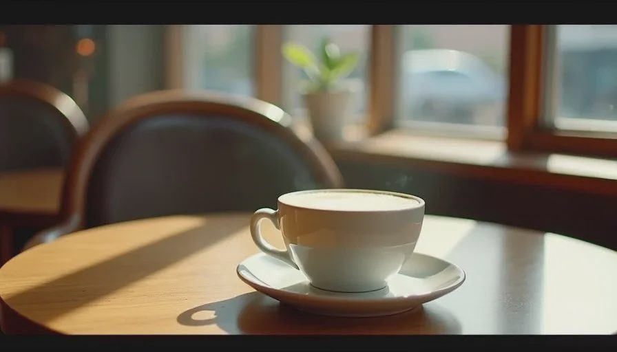
Campaigns that need a warm, inviting feeling more than exact food accuracy can use Image2.5 for supporting visuals—think coffee cups on a counter, pastry bags, or simple branded moments that do not require readable logos or precise dish details.
In all three cases the tool saves time when the brief is narrow and the expectation is directional rather than final-asset quality.
Where Image2.5 still falls short
Several restaurant needs remain difficult or unreliable.
Accurate food representation
Specific dishes with correct ingredients, proper cooking state, and believable texture frequently drift. Sauces look generic, proteins lose distinctive character, and plated arrangements become approximate. For any image that must represent what the guest will actually receive, real photography is still the safer route.
Readable menus, logos, and signage
Text performance is inconsistent. Short words sometimes survive; longer menu lines, prices, and logos usually distort or invent characters. Any frame that requires legible type needs external text handling or a different process.
Brand-critical interior accuracy
When the exact look of a dining room, bar, or patio matters for recognition or consistency with existing photography, Image2.5 often changes proportions, materials, or spatial relationships enough to feel off. It can suggest a mood; it rarely matches a specific room with high fidelity.
High-stakes campaign heroes
Primary images for website headers, large paid ads, or press use still benefit from controlled photography. The cost of a mismatched or slightly artificial-looking hero usually outweighs the speed advantage of generation.
A practical workflow for restaurant teams
When I work with restaurants that want to use Image2.5, we keep the scope limited and the evaluation strict.
Define the exact job of the image (concept only, social background, secondary promotional frame).
Write a short brief that locks the non-negotiables (key objects, material notes, light direction, forbidden elements).
Generate a small set and evaluate against the brief, not against general attractiveness.
Use successful frames only in the channels and roles they can support.
Archive prompts and notes so the next seasonal round starts faster.
This keeps the tool in the jobs it can currently perform and prevents it from being forced into roles it cannot fill reliably.
Prompt habits that improve restaurant results
A few language patterns help more than others:
Name the primary objects and their key visual features early.
Describe surface qualities in physical terms (matte ceramic, dry paper, soft linen) and add negatives for unwanted gloss or plastic appearance.
State light direction clearly when atmosphere matters.
Keep required text extremely short or omit it and add type later.
Limit the number of competing elements so the main subject stays readable.
These habits do not solve the deeper limits around food accuracy and fine text, but they raise the success rate on the tasks the model already handles reasonably well.
Realistic expectations for independent restaurants
Most independent operators I work with use Image2.5 in a supporting role. They generate concept frames to discuss new dishes with the kitchen, create simple ambiance images for stories, or explore seasonal color and mood directions. Final menu photography, primary website images, and any asset that must match the physical experience still come from real shoots or professional design work.
That division is healthy. It lets the restaurant move faster on low-stakes exploration while protecting the visual trust that food and hospitality brands require.
A short decision guide
Use Image2.5 when:
The image is for internal concept discussion or early mood testing
Exact food accuracy is not required
Text can be added later or kept very short
The frame is secondary rather than the primary brand image
Choose real photography or design work when:
The image must represent a specific dish accurately
Logos, full menu text, or precise branding must be readable
The interior must match the actual space closely
The asset will carry major marketing weight
Image2.5 is a practical addition to a restaurant’s visual toolkit when its strengths and limits are both respected. It accelerates certain kinds of exploration and supporting content. It does not yet replace the need for accurate food photography or carefully controlled brand imagery. Clear briefs and honest evaluation keep the tool useful without creating problems downstream.
Start with the job the image must do. The choice between generation and traditional methods becomes much clearer from there.